SHED
UX design
During the Covid period, most of the in-person classes and after school activities were cancelled. Many young people did not have the chance to connect with peers, get correct instructions and get right health help.
In this case, the app is designed to teach the children how to exercise healthier, what they can do while facing problems, and quickly contact the person they need for help. With the help of SHED, all kids can enjoy their after-class period playing soccer with their best friends.
Secondary Research
Non-proper soccer playing is one of key injury factors. Since most of the teenagers own a smart phone, it is important for them to have an app designed to solve the problem.
Information Architecture
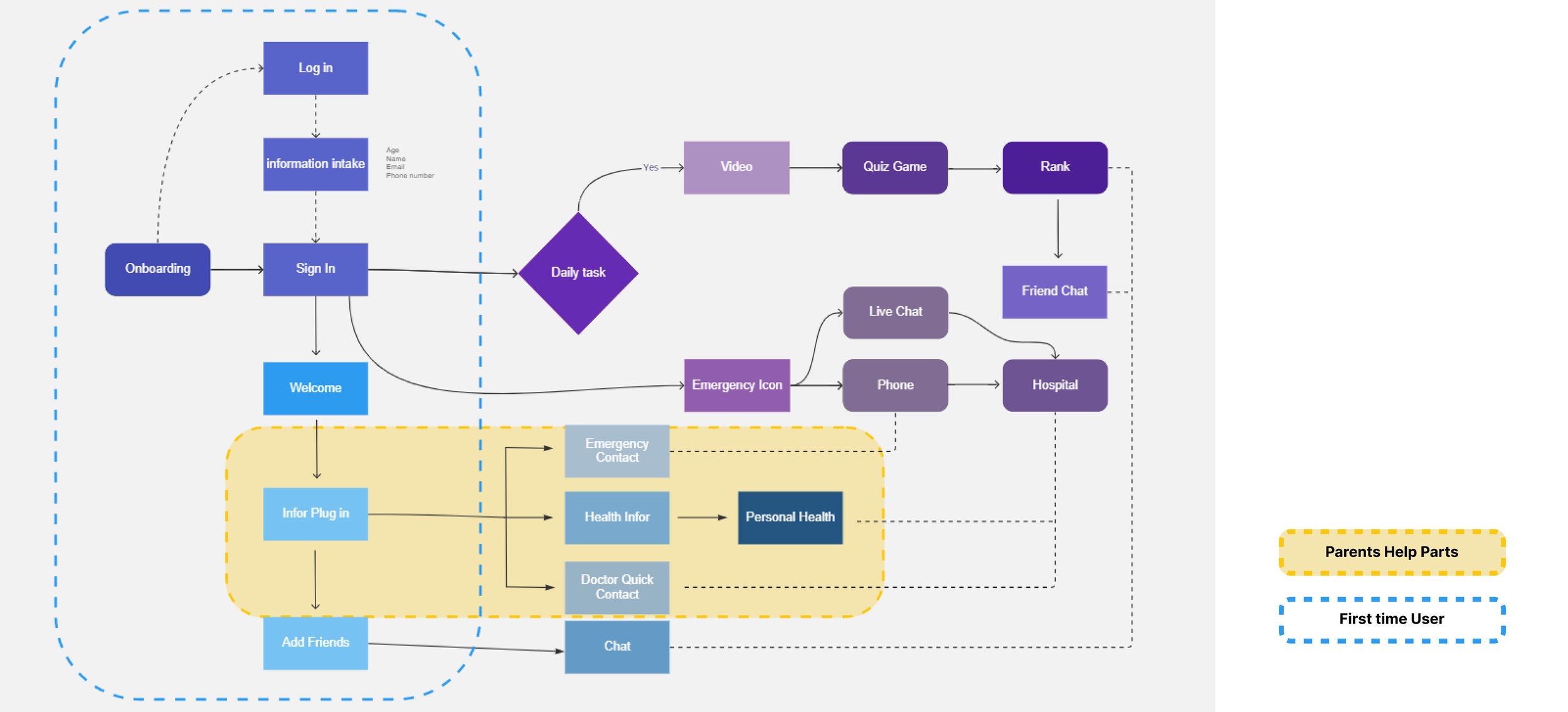
Shed has two different data entry paths: the first-time entry path (the path that teenagers had by them own), and the parent-help path (the professional monitor information). Also, there is a separate route of the teenager education part, for teenagers who can learn from the daily video and game.
Wireframe Design
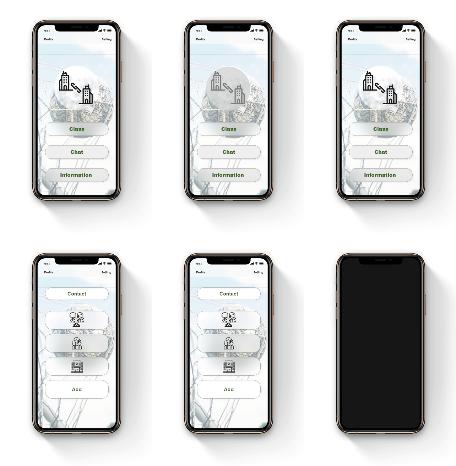
There are 3 different functions in this app: Education, Communication and Emergency Help. Other than that, there are other essential functions design for daily information update, in order to fulfill the app function.
UX Design
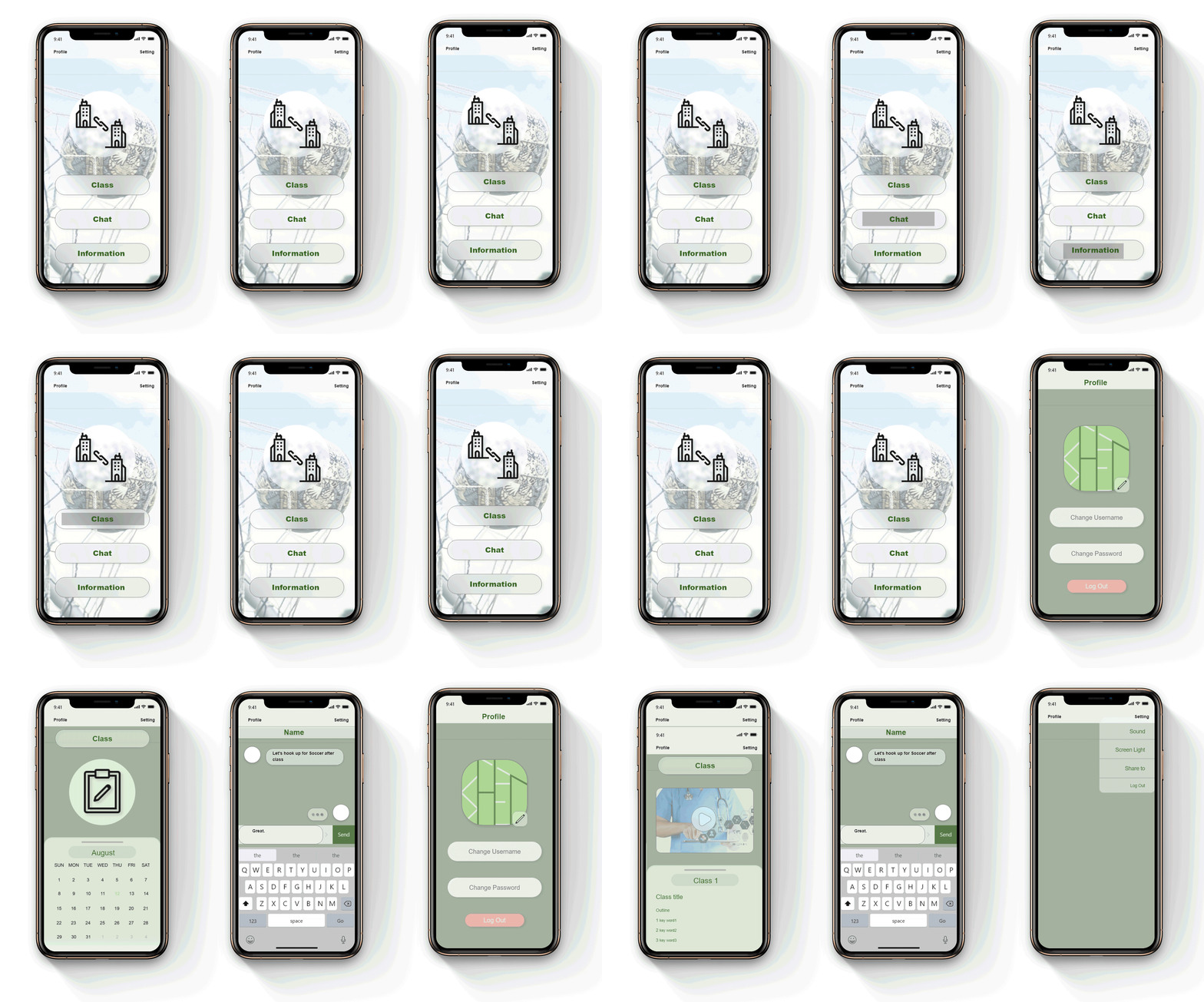
Connecting different functions and use the animation to show the potential user usage. This is a prototype that show the logic of the UX design.
The App has three main functions: taking daily classes, chatting with friends, and contacting professional support for help. There is also an information intake section for contact information storage and changing.
After clicking the Help button, you can choose the emergency contact you want to get help from.
These are three prototypes that showing: how daily education works, how user can use to chat with others, and the information intaking and changing.


